Mobile App Design. Interfaces designed to platform conventions users already know.
Interfaces designed to the platform conventions users already know, so a new app feels familiar from the first tap.
What you walk away with.
- 01Screens designed to native iOS and Android conventions
- 02A component library sized for real device screens
- 03Interaction and motion specs handed to engineering
Clicks to finish one job. Before and after a redesign.
- Today, across three tools38 clicks
- After the redesign, one screen9 clicks
Illustrative: booking, dispatching and invoicing one job.
What it can look like. Screens from systems like this.
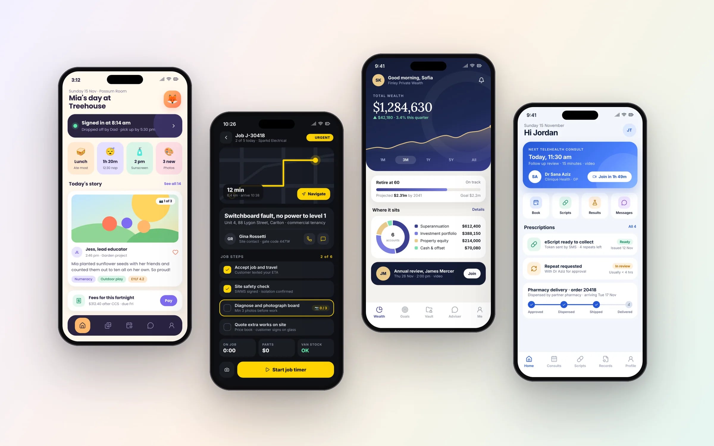
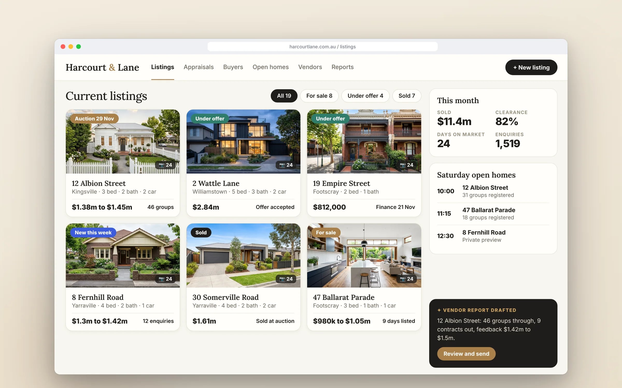
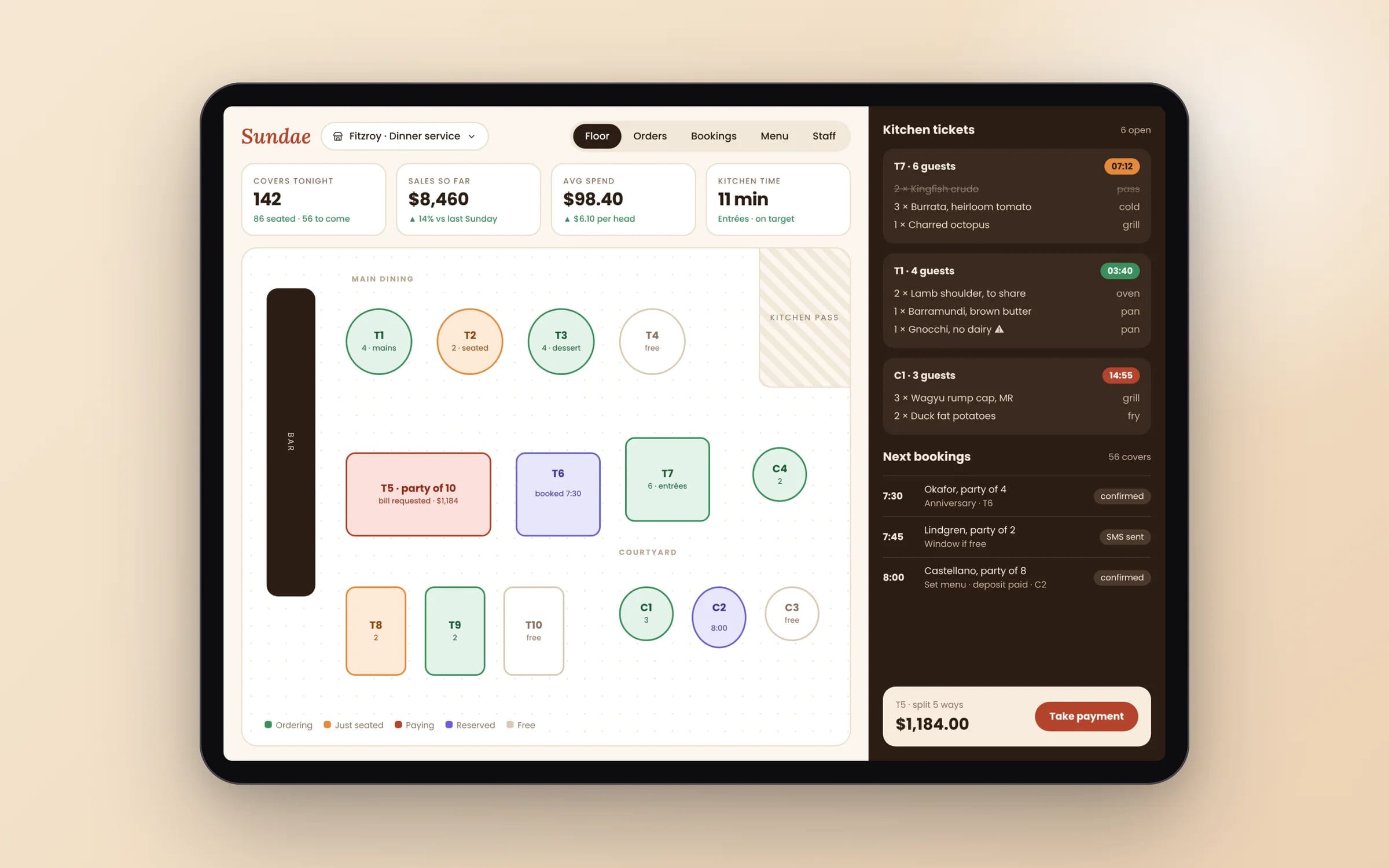
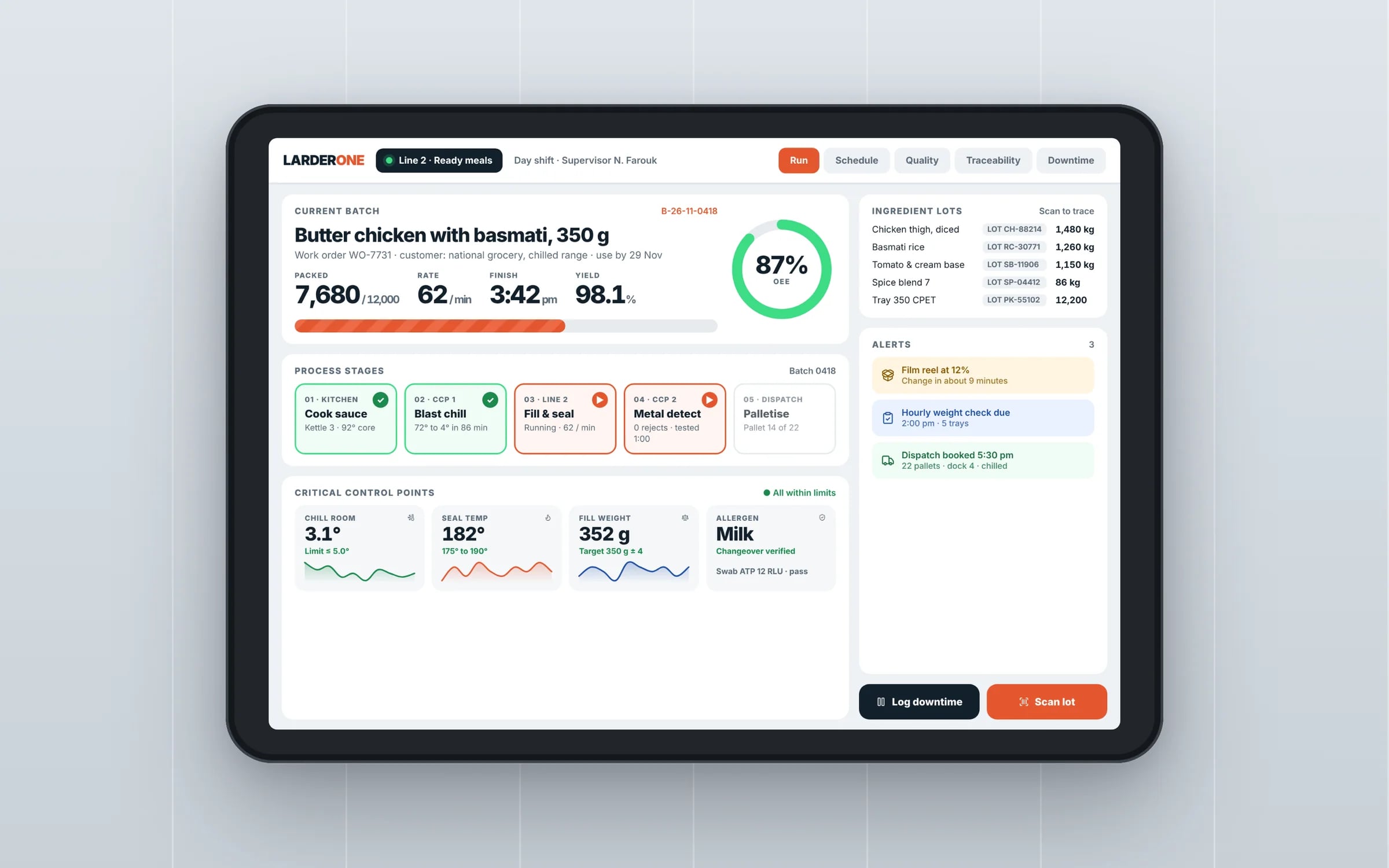
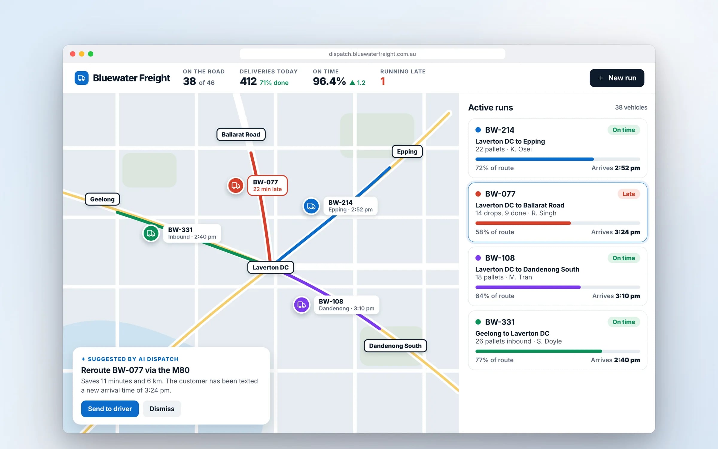
Example screens. The business names on them are invented.
You probably need this when
- 01Our app looks fine in the mockups, but crews struggle to use it on site.
- 02iPhone users say the app doesn't feel like a normal iPhone app.
- 03Staff wearing gloves keep tapping the wrong thing.
- 04We have a web product and want a proper mobile version of it.
★★★★★
“One of the BEST companies our business has worked with.”
What happens, in order.
1Map the moments of use
Where, when and how the app gets used: one-handed in a ute, gloved on a roof, or on the couch at night.
2Flows and platform patterns
Navigation and key flows set to iOS and Android conventions, with platform differences agreed up front.
3Prototype on real phones
Clickable prototypes tested on actual devices, outdoors where that's how the app will be used.
4Screens and component library
Final screens and components sized for real device widths and checked for contrast, text scaling and tap target size.
5Engineering handover
Interaction and motion specs, exported assets and store screenshots handed to the developers.
What is Mobile App Design?
Mobile app design is designing the screens, navigation and interactions of an iPhone or Android app so it follows the platform conventions people already know and suits the conditions they use it in.
It suits businesses building a new app or fixing one that feels awkward, especially apps used one-handed, outdoors or on the move by field crews, shift workers and customers.
Reviewed by the Hypex team, Port Melbourne
Questions owners ask.
Should the iOS and Android versions of an app look different?
The two versions should share your brand and screen structure but follow each platform's navigation and control conventions, because people expect their phone to behave consistently. That means respecting iOS swipe-back and Android's system back gesture, using each platform's date and time pickers, and following each platform's patterns for alerts and menus. Branding, colour, typography and layout can be identical. Fighting the platform makes an app feel foreign, while a consistent brand keeps it recognisable.
What tap target size should a mobile app use?
Apple's Human Interface Guidelines recommend tap targets of at least 44 by 44 points, and Google's Material Design recommends at least 48 by 48 density-independent pixels. WCAG 2.2 sets a smaller minimum of 24 by 24 CSS pixels at level AA, but the platform guidelines are the better target for apps. For field crews wearing gloves or working in a moving vehicle, go larger again and space targets apart so a thumb doesn't hit the wrong button.
How do you design an app for use outdoors and on site?
Design for outdoor and site use with high contrast, large text and controls, and as few steps as possible per task. Sunlight washes out pale greys, gloves make small buttons unusable, and people often hold something in their other hand, so primary actions sit within thumb reach. Forms should save as they go so a dropped connection or an interruption doesn't lose work. We check designs on a real phone outdoors before signing them off.
How is designing a mobile app different from designing a mobile website?
A mobile app can use native navigation, gestures, offline storage, push notifications and device hardware, while a mobile website works within the browser's controls and limits. App design follows iOS and Android conventions such as tab bars and system back behaviour; mobile web design has to work around the browser's address bar and back button. Apps also need designs for store listings, permission prompts and notifications. If people only use it occasionally, a responsive website often serves them better.
When should an app ask for camera or location permission?
An app should ask for camera or location permission at the moment the feature is needed, with a short explanation of why. A worker tapping Add site photo understands a camera prompt, while the same prompt on a welcome screen tends to get declined. On iOS a declined permission can only be changed in Settings, and Android stops showing the prompt after repeated refusals, so design a clear path back for anyone who said no. Apple checks permission explanations during App Store review.
What should a mobile app designer hand over to developers?
A mobile app designer should hand over every screen at the supported phone sizes, the component library, interaction and motion specs, and every state a screen can be in. That includes loading, empty, error, offline and permission-denied states, plus how layouts behave when users enlarge system text. Motion specs describe transitions and gestures precisely enough to build. Icons and images should be exported in the formats each platform needs, and the store screenshots designed as well.
Designing for iOS vs Android.
- Design guidance
iOSApple Human Interface Guidelines
AndroidGoogle Material Design
- Back navigation
iOSSwipe from the left edge, or the back button in the navigation bar
AndroidSystem back gesture or button, available on every screen
- Main navigation
iOSTab bar at the bottom of the screen
AndroidNavigation bar at the bottom, or a navigation drawer
- Recommended minimum tap target
iOS44 by 44 points
Android48 by 48 dp
- System font
iOSSan Francisco
AndroidRoboto, or the device maker's own font
What moves the cost and the timeline.
After a 30-minute call you get a system map with a fixed price for each stage, before any work starts. These are the things that shape it.
- Whether iOS and Android get separate platform treatments or one shared design
- Number of user roles and core flows
- Tablet layouts in addition to phone
- Amount of motion and custom interaction
- Accessibility depth beyond the baseline
Built for businesses like yours
Show us how you run it today.
Thirty minutes with the people who would build it. We'll map where the hours go and tell you honestly whether custom software is worth it for you.